Poetry Book
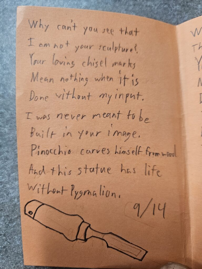
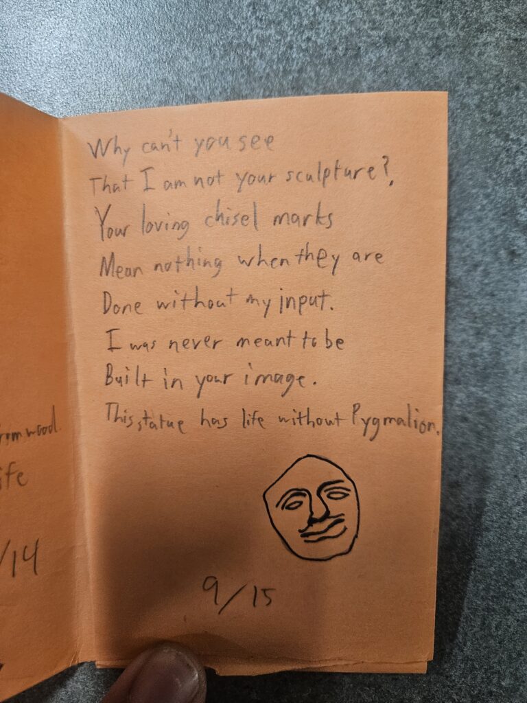
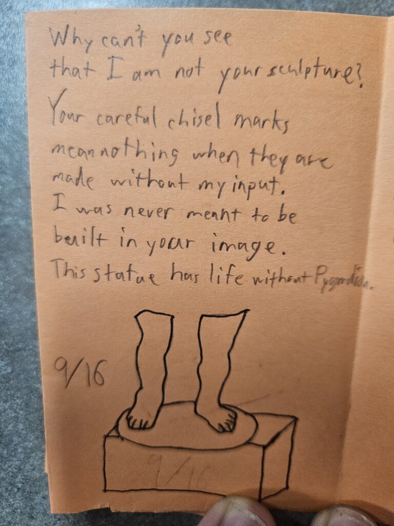
I kept much of the core of my poem the same through the various drafts. I feel like that core was really good with the statue metaphor, but the first draft was a little confused with references to both Pinocchio and Pygmalion. Since I liked the imagery of stone, I went with Pygmalion and cut the Pinocchio line. From there, it was largely experimenting with specific words. In particular, I was really unhappy with the word “done” starting the fourth line. “Done” feels weak, and I am so glad that I was able to find a more vivid word in “cut.” Similarly, the word “grooves” shows a more measured approach to creation than “marks” which feels more haphazard. Every poem I had written as a part of this course previously had every line capitalized since I write in Word and the program auto-capitalizes every line. I wanted to break from that format, and I also wanted to add a space between what would become the two stanzas. It makes it feel like there’s a pause between the two statements which gives the second stanza more weight. I made the space even longer partially to extend that pause but also to allow me to put some form of visual in that space. Going back and forcing myself to create multiple drafts definitely let me home in on what I wanted the poem to say. I’m now thinking of going back to my other poems and giving them a second look.
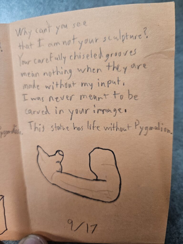
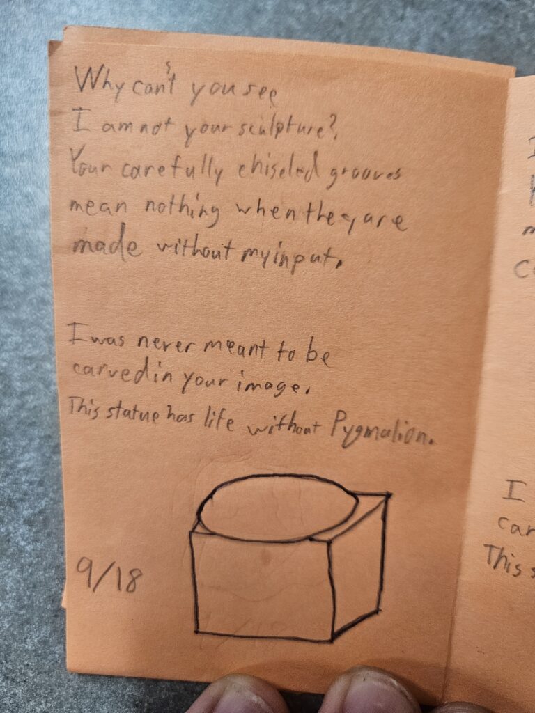
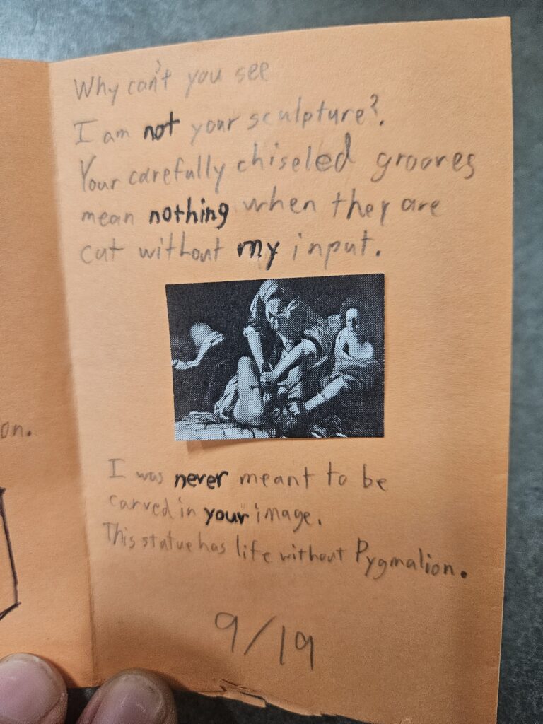
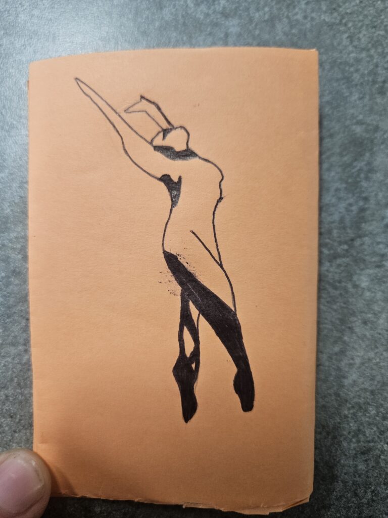
The creation of the booklet was harder than I initially thought it would be and not just because of my lack of artistic technique! Going in, I had 3 images in mind. The front cover of a torso, the face on page 2, and the dancer on the back cover. Everything I drew was taken from a reference image. The front cover and the face were referenced from the Venus de Milo, the arm on page 4 is from the statue of David, and the legs are from a painting of Pygmalion (how fitting!). I wanted there to be a progression through the pages. We start with the chisel, and then various disparate body parts as if we are watching the sculpture be created. On the last pages, the statue comes to life and kills her creator. I wanted this moment to have impact, and so I decided to make this the only part not drawn by me. I feel like the painting, Judith slaying Holofernes by Artemisia Gentileschi, is filled with such intense emotion that I couldn’t try to bring that same energy with my skill level. Since it is a painting placed into the book rather than my sketch, it feels like a flash of reality. The back cover is a dancer inspired by the poster to Suspiria (1977).
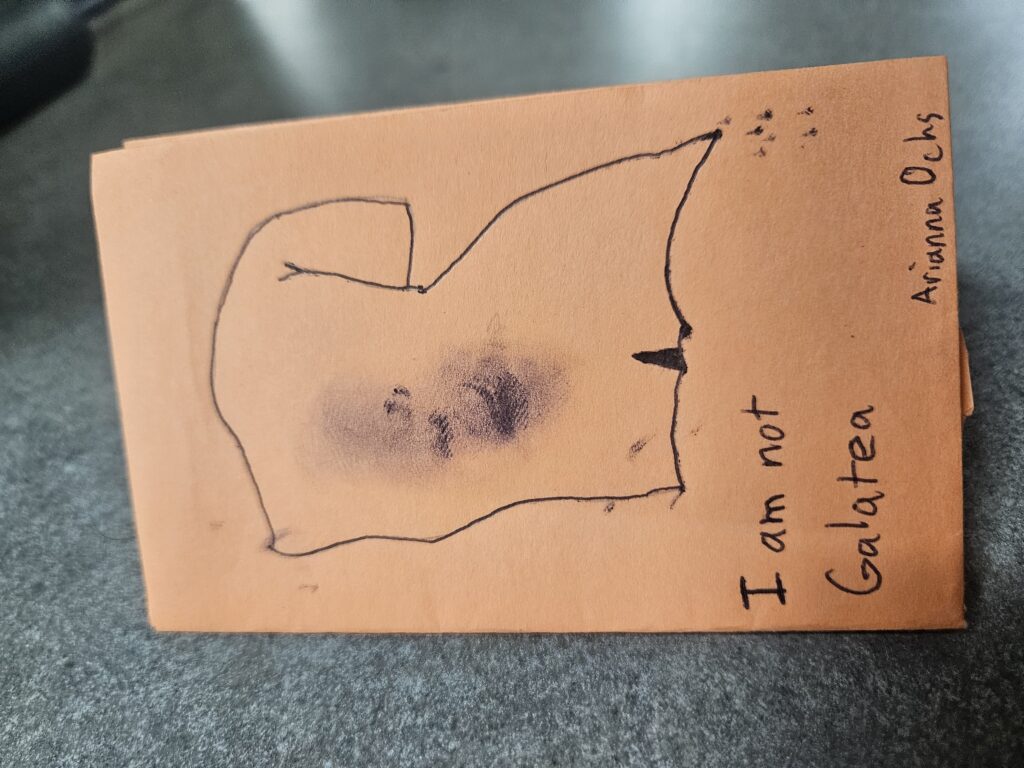
I am not Galatea

Why can’t you see
I am not your sculpture?
Your carefully chiseled grooves
mean nothing when they are
cut without my input.


I was never meant to be
carved in your image.
This statue has life without Pygmalion.